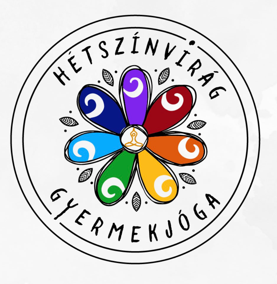
A lovely tiny project designing a logo for a woman who is a yoga teacher for kids. Therefore we needed colors, a simple pattern that child will notice and remembers, and a bit playful, not perfect design. I worked based on her ideas and we kept shaping the logo together. Below of this text you can see the final result on light and dark background.

BRAINSTORM:
First, she sent me her ideas and the name and after discussing that, I started sketching. The hungarian word ´Hétszínvirág´ means ´seven color flower´ that is why she wanted a flower and also because it is easy to draw for kids, representing also the 7 chakras that is related to yoga.
For the shape she insisted to have the whole logo in a round frame, so I planned according to that.
She sent me the first picture with her ideas and I started working based on that.
SKETCHING:
On the picture in the middle you can see my first, disorganised sketches. I chose the flower to be the main element and enhancing it with simple patterns. Then to express the product of the business, I added simple icons with figures in different yoga positions. From these i chose the ones that fit with the middle of the flower the best.
On the picture in the middle you can see my first, disorganised sketches. I chose the flower to be the main element and enhancing it with simple patterns. Then to express the product of the business, I added simple icons with figures in different yoga positions. From these i chose the ones that fit with the middle of the flower the best.
After showing the sketch and discussing which way to continue, I made the third picture, a little sheet with her most preferred ideas.
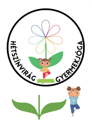
My client´s brainstorming image.

My own sketches taking the flower as the main element.

Different versions to frame the flower and the whole logo.
FONTS:
She chose a final design, so next I tried different fonts with it. I designed the flower with wobbly, imperfect lines so I tried to find a similar, playful but clear font.
The best match for this ´kid vibe´was a font called: Lullabies.
She chose a final design, so next I tried different fonts with it. I designed the flower with wobbly, imperfect lines so I tried to find a similar, playful but clear font.
The best match for this ´kid vibe´was a font called: Lullabies.
ADJUSTMENTS:
My client wanted to change the letter ´E´ and see the design with a double circle around.
Then final 3 versions she wanted:
a) variation with double, closed circles around the pattern
My client wanted to change the letter ´E´ and see the design with a double circle around.
Then final 3 versions she wanted:
a) variation with double, closed circles around the pattern
b) variation with the inner circle opened with the dot and line of letter ´i´ and ´y´
c) variation where the yoga figure in the middle has a color. Preferably orange.
The final decision was: variation c).
The final decision was: variation c).
Fixed letter "E"

Variation a) and b)
